Let's cut straight to it: mobile-first design isn't just a buzzword anymore. It's the foundation of every successful website in 2026.
But here's the thing, mobile-first has evolved. It's no longer about shrinking your desktop site to fit a smaller screen. Today, it's about performance, accessibility, and creating experiences that feel native to how people actually use their devices.
If you're still wondering whether mobile-first design matters for your small business, the short answer is yes. The longer answer? Keep reading.
What Mobile-First Design Actually Means in 2026
Back in the early days, mobile-first meant designing for smartphones before desktops. Simple enough. You'd sketch out your mobile layout first, then scale up for larger screens.
That core principle still holds true. But in 2026, mobile-first design has become something much bigger.
Today, mobile-first means:
- Performance optimization from the ground up
- Accessibility baked into every element
- User experiences tailored to touch, voice, and gesture interactions
- Lightning-fast load times that keep impatient users engaged
Think about how you use your own phone. You're scrolling through search results while waiting for coffee. You're comparing services during your lunch break. You're making quick decisions with your thumb.
Your customers are doing the exact same thing. And if your website doesn't deliver a seamless experience in those moments, they're gone.
The Numbers Tell the Story
Still not convinced? Let's look at what the data says.
Over 60% of global web traffic now comes from mobile devices. That's not a trend, it's the new normal. And Google? They've been using mobile-first indexing for years, meaning they look at your mobile site first when deciding where you rank in search results.
Here's where it gets interesting for your bottom line:
- Mobile-first design typically improves loading speeds by 30-50%
- Businesses with mobile-first websites see 75% more repeat visits
- Higher engagement, better conversions, and improved revenue follow naturally
Mobile users have zero patience for slow, cluttered websites. We're talking about people who will bounce in seconds if your site doesn't load fast or looks broken on their screen.
And it's not just B2C anymore. B2B buyers are making decisions on mobile devices too. That enterprise client researching your services? There's a good chance they're doing it from their phone during a commute.
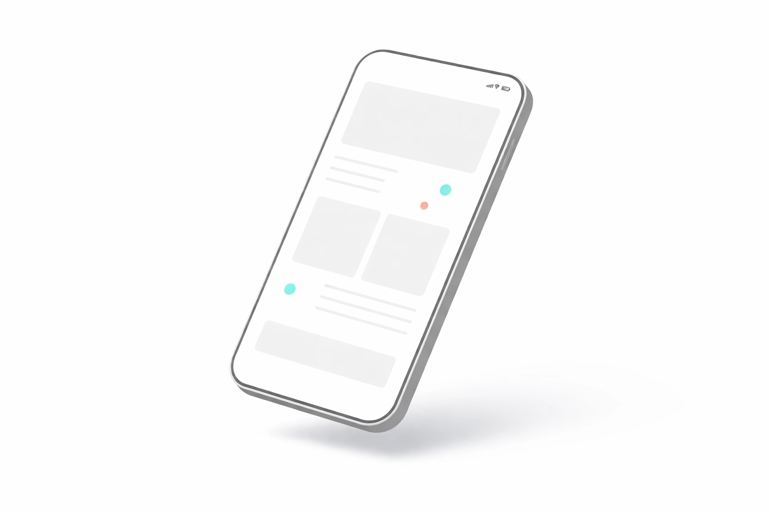
It's Not Just About Fitting on a Screen
Here's where a lot of businesses get it wrong.
They hear "mobile-friendly" and think, "Great, my site resizes. We're good." But there's a massive difference between a site that technically works on mobile and one that's truly optimized for the experience.
Performance Is Everything
Mobile-first design forces you to think lean. When you design for mobile constraints first, you naturally create faster, more efficient websites. You're not loading unnecessary scripts, oversized images, or bloated code that slows everything down.
This performance boost doesn't just help mobile users, it makes your entire site faster across all devices. And site speed directly impacts your search rankings, user engagement, and conversions. We've written extensively about why website speed will make or break your business in 2026, and the stakes are only getting higher.
Accessibility Is Non-Negotiable
True mobile-first design considers every user. That means proper touch targets for buttons, readable font sizes without zooming, logical navigation patterns, and compatibility with screen readers and assistive technologies.
When you design for mobile first, you're forced to simplify. That simplification often results in more accessible websites across the board. It's a win-win that many businesses overlook. If you're curious about where your site might be falling short, check out our post on common website accessibility mistakes.

Unique User Experiences
Mobile users interact differently than desktop users. They tap, swipe, pinch, and increasingly use voice commands. A truly mobile-first website anticipates these behaviors and creates experiences that feel intuitive.
Think about:
- Thumb-friendly navigation that doesn't require awkward reaching
- Streamlined forms that don't frustrate users on small keyboards
- Click-to-call buttons that connect customers instantly
- Location-aware features that personalize the experience
These aren't nice-to-haves. They're expectations in 2026.
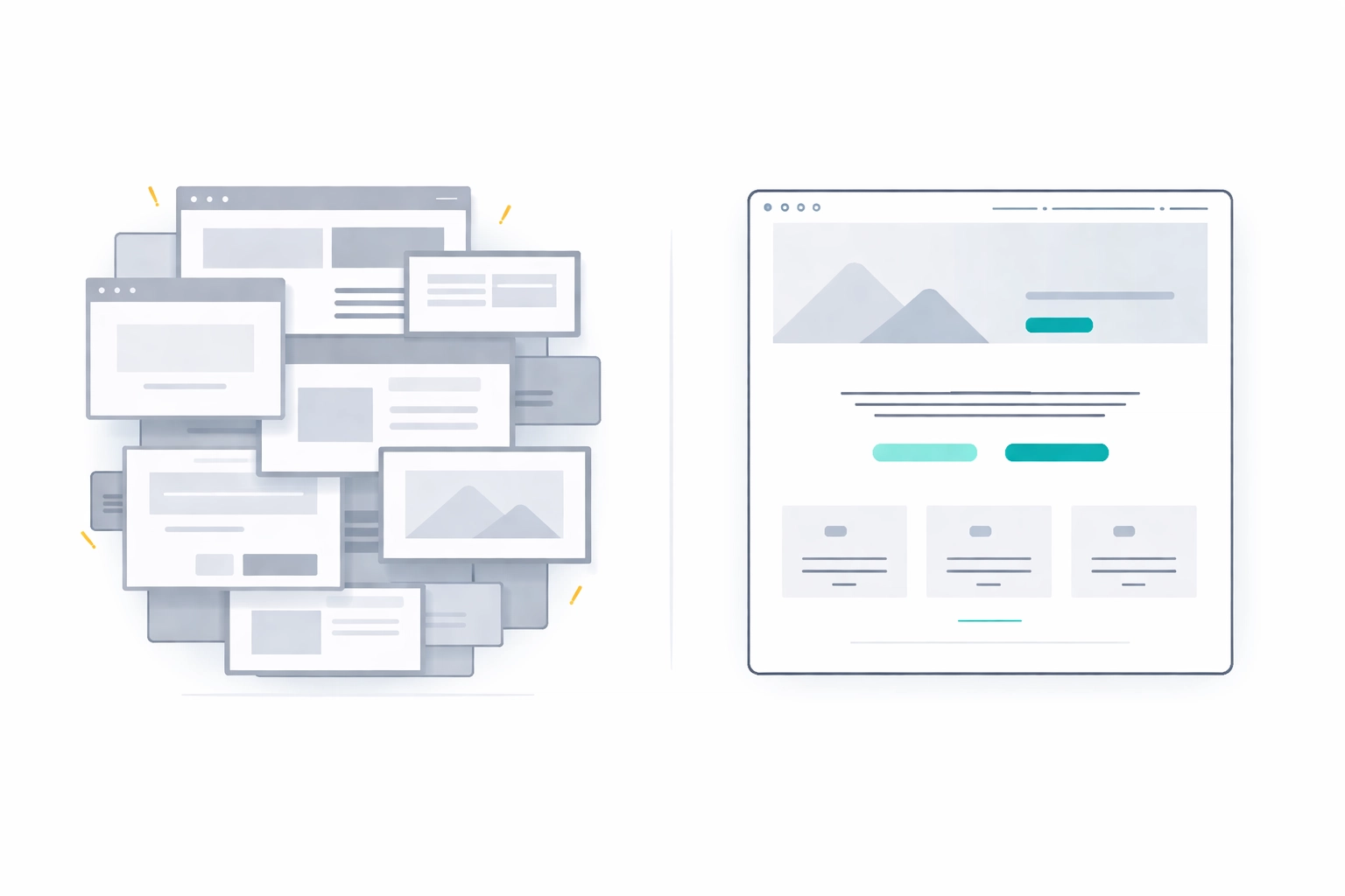
The Template Trap: Why "Mobile-Friendly" Claims Fall Short
Here's where we need to have an honest conversation.
Plenty of website templates and DIY builders claim to be mobile-friendly. And technically, they are. They'll resize. They'll stack content. They'll probably look okay on a phone.
But "okay" isn't good enough anymore.
Templates are built to work for everyone, which means they're optimized for no one. They carry extra code, generic functionality, and compromises that slow things down. When you're competing for attention in a mobile-first world, those compromises cost you customers.
What Custom-Built Sites Deliver
A custom-built website designed with mobile-first principles gives you:
- Clean, optimized code without the bloat
- Performance tuned specifically for your content and features
- Accessibility built into the foundation, not bolted on as an afterthought
- User experiences tailored to your audience's actual behavior
- Flexibility to implement unique interactions that templates simply can't handle
We've broken down the full comparison in our guide on custom web design vs templates, but the short version is this: if you're serious about competing in 2026, custom is the way to go.
One codebase. One maintenance path. Zero compromises on performance or user experience.
How to Know If Your Site Is Truly Mobile-First
Not sure where your current website stands? Here's a quick checklist to evaluate your mobile experience:
Speed Test
- Does your site load in under 3 seconds on mobile?
- Do images load quickly without visible compression artifacts?
- Is there any layout shift as elements load?
Usability Check
- Can you navigate the entire site easily with just your thumb?
- Are buttons and links large enough to tap without zooming?
- Do forms work smoothly with mobile keyboards?
Content Evaluation
- Is essential information visible without excessive scrolling?
- Are fonts readable without pinching to zoom?
- Does the content hierarchy make sense on a small screen?
Technical Review
- Is your site using mobile-first indexing properly?
- Are you serving appropriately sized images for mobile devices?
- Does your site work well on various screen sizes, not just the latest iPhone?
If you're answering "no" or "I'm not sure" to several of these questions, your site might be mobile-friendly in name only.
The Bottom Line: Mobile-First Is the Standard
Mobile-first design isn't a competitive advantage in 2026: it's the baseline. Businesses that fail to adopt it risk losing visibility in search results, frustrating potential customers, and falling behind competitors who've already made the shift.
The good news? It's never too late to get it right.
Whether you're building a new site or evaluating your current one, the principles remain the same: prioritize performance, build in accessibility from the start, and create experiences that respect how people actually use their devices.
A custom-built, mobile-first website isn't just about keeping up with trends. It's about setting your business up for success in a world where the smartphone in your customer's hand is often the first: and sometimes only: touchpoint they'll have with your brand.
Ready to see how your website measures up? Get in touch with our team and let's build something that works as hard as you do.