Here's something that might surprise you: over one billion people worldwide live with some form of disability. That's roughly 15% of the global population. And if your website isn't accessible to them, you're not just missing out on potential customers: you might also be hurting your SEO and user experience for everyone.
Website accessibility isn't just a legal checkbox or a nice-to-have feature. It's about creating a digital space where everyone can navigate, understand, and interact with your content. The good news? Most accessibility issues are surprisingly easy to fix once you know what to look for.
Let's dig into the most common website accessibility mistakes we see: and how you can fix them today.
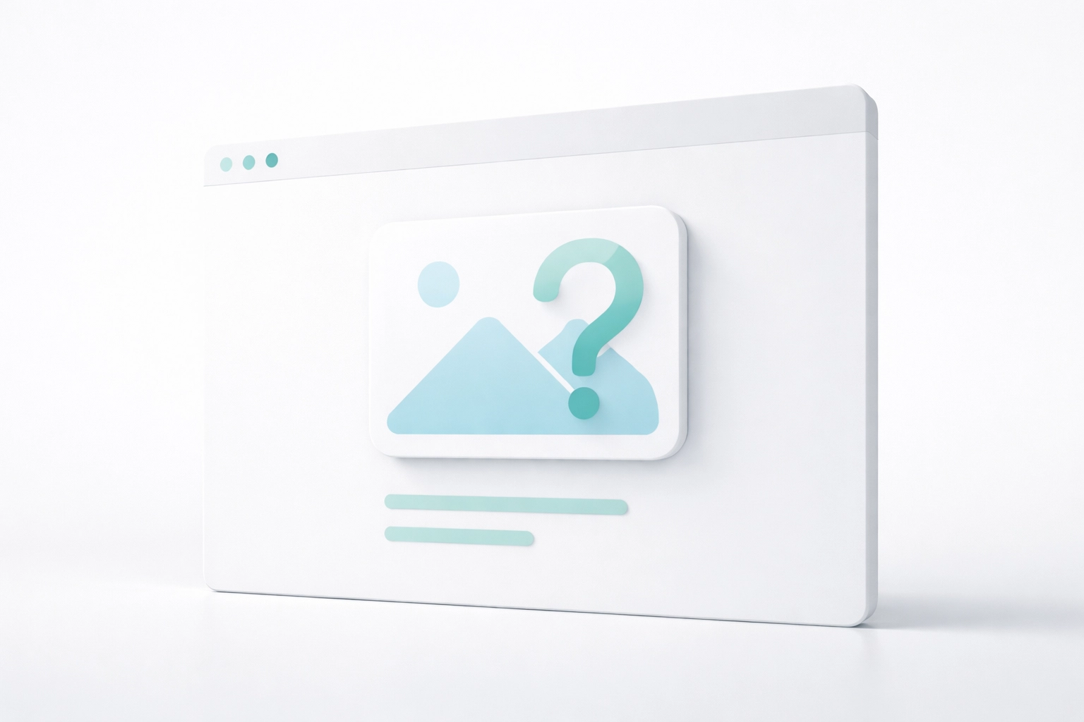
Missing or Vague Alt Text on Images
This one tops almost every accessibility audit we run. Alt text (that little description you add to images) helps screen reader users understand what's on the page. Without it, they're left guessing.
The mistake: Leaving alt text blank, using generic descriptions like "image" or "photo," or stuffing keywords in there for SEO purposes.
The fix: Write concise, descriptive alt text that actually explains what the image shows and why it matters. Instead of "dog," try "Golden retriever playing fetch in a sunny park." If an image is purely decorative, you can use an empty alt attribute: but don't just skip it entirely.
Here's the bonus: search engines can't "see" images either. They rely on alt text to understand your visual content. Better alt text means better SEO. Win-win.
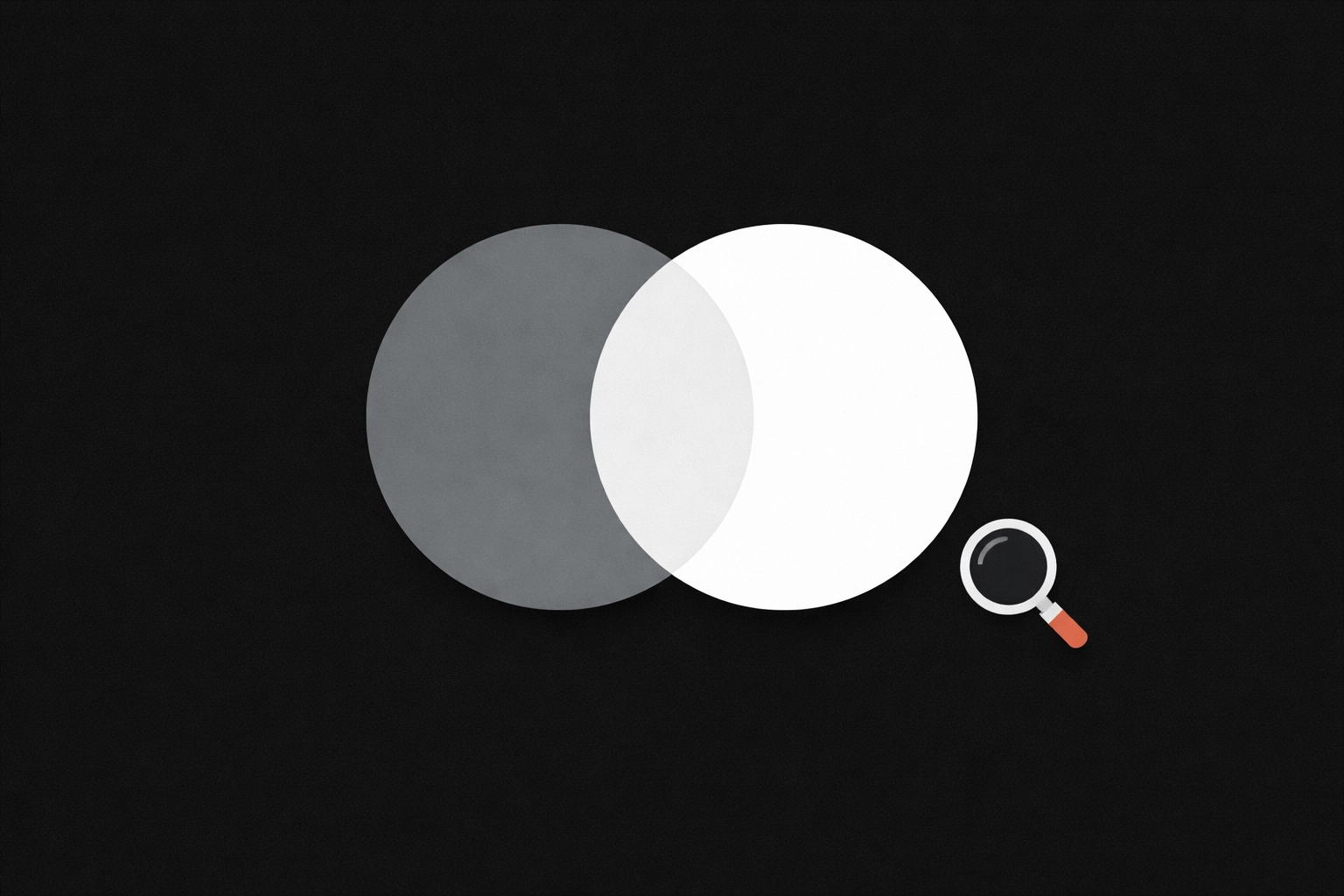
Poor Color Contrast That Strains Eyes
Ever tried reading light gray text on a white background? It's frustrating for anyone, but for users with visual impairments, it can make your content completely unreadable.
The mistake: Using trendy color combinations that look sleek but fail to meet contrast requirements. Those minimalist "ghost buttons" with thin, low-contrast borders? They're a common culprit.
The fix: Aim for a contrast ratio of at least 4.5:1 for regular text and 3:1 for large text and UI components like buttons. Free tools like WebAIM's Contrast Checker make this easy to test.
The reality is that high-contrast designs are easier to read for everyone: whether they're browsing on a sunny patio or dealing with tired eyes at the end of a long day. Accessibility improvements often double as UX improvements.
Keyboard Navigation That Goes Nowhere
Not everyone uses a mouse. Some people rely entirely on keyboard navigation due to motor disabilities, while others simply prefer it. If your site traps users in dropdown menus or makes it impossible to tab through your content, you've got a problem.
The mistake: Creating "keyboard traps" where focus gets stuck, hiding focus indicators (that outline you see when tabbing through links), or making interactive elements inaccessible via keyboard.
The fix: Test your site by putting your mouse away and navigating with just the Tab, Enter, and arrow keys. Can you reach every link, button, and form field? Can you see where your focus is at all times? If not, it's time to make some changes.
Visible focus indicators aren't just helpful: they're essential. And they benefit power users who prefer keyboard shortcuts too.
Broken Heading Structure
Screen reader users often navigate pages by jumping between headings. It's like scanning a table of contents. When your heading structure is messy, that navigation falls apart.
The mistake: Skipping heading levels (going from H2 straight to H4), using headings just because you want bigger, bolder text, or having multiple H1 tags on a single page.
The fix: Treat headings like an outline. Your page gets one H1 (usually the title), followed by H2s for main sections, H3s for subsections, and so on. Never skip levels, and don't use heading tags purely for styling: that's what CSS is for.
Proper heading structure also helps search engines understand your content hierarchy, which can boost your rankings. If you're working on optimizing your site, check out our guide on how to future-proof your small business website for more tips.
Generic Link Text That Tells Users Nothing
"Click here." "Read more." "Learn more."
These phrases are everywhere, and they're a nightmare for accessibility. Screen reader users often navigate by pulling up a list of all links on a page. When every link says "click here," that list becomes useless.
The mistake: Using vague, non-descriptive link text that doesn't explain where the link leads.
The fix: Make your link text descriptive and specific. Instead of "Click here to learn about our services," try "Explore our web design services." The link text should make sense even when taken out of context.
This small change makes a huge difference for accessibility: and it's better for SEO too, since search engines use link text to understand what you're linking to.

Forms That Frustrate Everyone
Forms are where conversions happen. They're also where accessibility often breaks down.
The mistake: Missing field labels, unclear error messages, unlabeled required fields, and CAPTCHAs that only work visually.
The fix: Every form field needs a clear, descriptive label. Error messages should explain exactly what went wrong and how to fix it: and they should be programmatically linked to the specific field with the issue. For CAPTCHAs, offer audio alternatives or consider using invisible reCAPTCHA.
Good form design reduces friction for all users, not just those using assistive technology. Fewer abandoned forms mean more leads. Simple as that.
Missing Semantic HTML and ARIA Labels
Modern HTML gives us tags like <nav>, <main>, <section>, and <footer> that help assistive technologies understand page structure. When you ignore these and build everything with generic <div> tags, screen readers struggle to make sense of your layout.
The mistake: Relying entirely on <div> elements, skipping semantic HTML5 tags, and forgetting ARIA labels for dynamic elements like tabs, accordions, and modal windows.
The fix: Use semantic HTML wherever possible. Add ARIA attributes to interactive components that need extra context. For example, a hamburger menu icon should have an aria-label like "Open navigation menu" so users know what it does.
This isn't just about compliance: it's about building websites that work the way they should.
Relying Only on Automated Testing Tools
Here's a reality check: automated accessibility tools are helpful, but they can't catch everything. Studies show they detect only about 30-40% of accessibility issues.
The mistake: Running a quick automated scan, seeing a passing score, and assuming your site is fully accessible.
The fix: Use automated tools as a starting point, then supplement with manual testing. Navigate your site with a keyboard. Try it with a screen reader. Ask real users for feedback.
At Create Pro Media, we combine automated testing with hands-on reviews to catch the issues that tools miss. It's the only way to build truly accessible websites.
Why Accessibility Matters Beyond Compliance
Let's be real: avoiding lawsuits and meeting ADA requirements are valid reasons to care about accessibility. But the benefits go way beyond that.
Better user experience for everyone. Captions help people watching videos in noisy environments. High contrast helps users on mobile devices in bright sunlight. Keyboard navigation helps power users move faster.
Stronger SEO performance. Many accessibility best practices: like proper heading structure, descriptive alt text, and semantic HTML: are also SEO best practices. Google rewards sites that are well-organized and easy to understand.
Larger potential audience. When your site works for everyone, you're not leaving money on the table. You're welcoming customers your competitors might be turning away.
Take the First Step Today
Accessibility doesn't have to be overwhelming. Start by auditing your site for the issues we covered here. Fix the easy wins first: alt text, color contrast, link text: and build from there.
If you're not sure where your site stands or you want help making it more inclusive, we're here to help. Accessibility is baked into everything we build at Create Pro Media, because we believe great design should work for everyone.